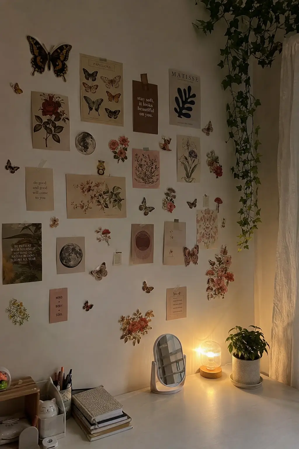
The little details are what make vintage botanical prints so appealing: a fern drawn in fine green lines, a wildflower on warm cream paper, the tiny lettering beneath a plant. Even a small collection can have a lot of character when those illustrations come together.
But the wall in the photograph isn’t the wall above your desk. Your space might be narrower, there could be a shelf in the way, or the prints you’ve found might look a little different from one another. The same arrangement won’t necessarily give you the same result. That doesn’t mean losing the look you loved in the first place. You can keep the old botanical character and give the collection a shape that makes sense in your own room.
What Makes Vintage Botanical Prints Work Together
There’s a lovely difference between a botanical illustration that looks as though it came from an old field guide and a softly painted flower that feels more decorative. The first might show a single plant with its roots, leaves, and a tiny specimen name carefully recorded beneath it. The second might fill nearly the entire page with color. Both can belong in a vintage-inspired collection, but they’ll give the wall different kinds of character.
A fine-lined fern, for example, can have almost as much cream paper around it as actual drawing. Put it beside a richly colored flower, and the flower will probably catch your eye first, even if the two prints are exactly the same size. I wouldn’t rush to separate them. That contrast could be the interesting part, especially if the collection already has several quieter illustrations.
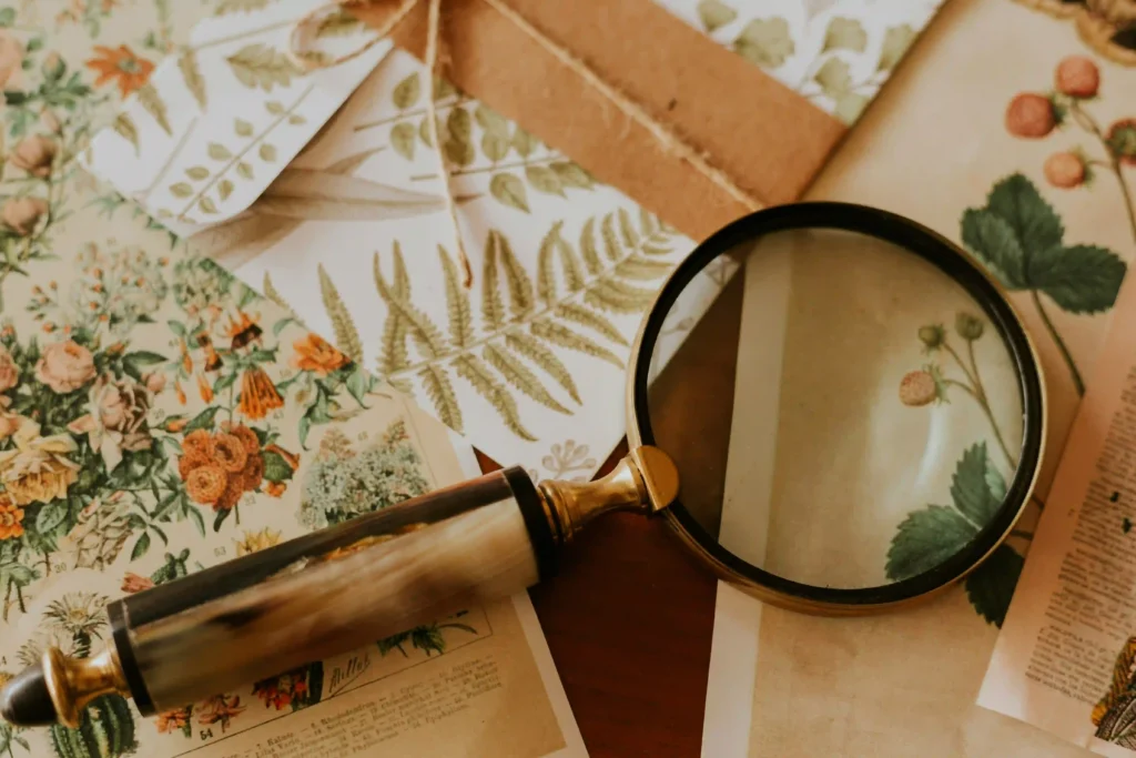
For a more old-fashioned, specimen-book look, I’d lean toward drawings that share a similar treatment. Think delicate ferns, wildflowers shown against pale paper, or small botanical studies with the original lettering still visible. There’s something appealing about letting the differences between the plants stand out while the illustrations themselves feel connected.
A mixed floral collection can be just as lovely in another way. A faded pink flower beside an olive-green leaf study, a slender stem next to a fuller arrangement of blossoms, perhaps one darker print among the lighter ones. If two illustrations seem a little disconnected, look at their backgrounds before ruling either one out. The plants may be completely different, but similar warm paper tones or fine linework can give them something in common.
It’s worth looking beyond the plant itself, too. The wide margins, little labels, and slightly irregular paper tones are often what make vintage botanical artwork interesting. Cropping every illustration tightly to fill an identical frame can take away some of that character. I’d rather keep a beautiful specimen label visible than lose it for the sake of making every print appear the same size.
If you don’t feel like collecting prints one by one, a vintage botanical print set gives you a selection to work with. I’d start with the illustrations that caught my eye rather than feeling I had to use every print in the set.
Finding the Right Arrangement for Your Wall
Once you’ve found illustrations that look good together, the way you arrange them changes the whole effect. A simple grid is particularly appealing with botanical specimen drawings. Six or eight similarly sized illustrations, lined up with even spacing, can have the orderly feeling of pages from an old natural-history book. The plants themselves provide plenty of variation, so the arrangement doesn’t need to do anything especially elaborate.
I’d keep the frames fairly simple for this kind of collection, if you’re using frames at all. Thin wood or understated dark frames can let the drawings remain the focus. You could also leave small prints unframed for a softer, less formal wall collage. There’s no need to make the arrangement complicated when the illustrations themselves are what caught your eye.
A looser grouping makes more sense when you’ve collected illustrations in different sizes or styles. Maybe there’s one larger wildflower print you’ve grown particularly fond of, a couple of smaller fern studies, and a delicate floral illustration with a wider paper border. Instead of forcing them into identical rows, you can gather them into a compact shape that lets those differences feel deliberate.
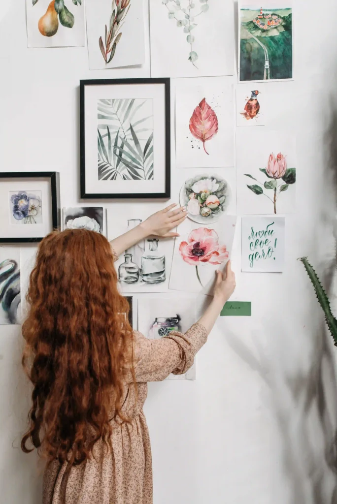
The overall outline matters here. A loose collage doesn’t have to mean prints scattered randomly across the wall. You can vary the positions and still keep the collection visually connected. When you’re testing the arrangement on the floor, stand back far enough to see the entire grouping rather than looking at each illustration individually. It’s often easier to notice an uneven shape from a little distance. A larger illustration near the middle can help in some arrangements, although a collection of similarly sized prints doesn’t necessarily need an obvious centerpiece.
Another look I especially like is a narrow botanical grouping above a desk or small piece of furniture. It doesn’t need to occupy the entire wall. A few small illustrations placed close enough to read as one collection can be more interesting than stretching the same prints across every available inch. And this is where the wall you actually have matters more than the arrangement in the photograph.
Imagine you have eight unframed 4×6-inch botanical cards, all in portrait orientation, and you’d like roughly an inch between them. Arranged in four columns and two rows, the collection measures about 19 inches wide and 13 inches tall. Turn those same cards into two columns and four rows, and the grouping becomes approximately 9 inches wide and 27 inches tall.
Now picture a desk wall with 24 inches of usable width and only 23 inches of height beneath a shelf. The tall version won’t fit, but the wider two-row arrangement will. Nothing about the artwork has changed. You’ve simply given the collection a different shape, one that makes more sense for the wall you actually have.
Framing the prints changes the measurements again. A small illustration can take up considerably more wall space once it’s framed, especially if you’re using a wide mat. Before hanging anything, lay the complete arrangement out on the floor or use paper templates cut to the frames’ outer dimensions. It’s much easier to notice a grouping that’s too tall or too spread out before making holes in the wall.
The room around the artwork deserves a glance as well. If you’ve already got patterned bedding, a colorful rug, and several things on the desk, a regular group of delicate botanical drawings might be a lovely contrast. In a simpler room, larger flowers or a fuller, more varied collage could bring in a different kind of detail.
Lighting can change what you notice, too. Cream paper may look warmer beside a lamp, while a dark botanical illustration could lose some of its detail in a dim corner. If you mostly see the collage in the evening, it’s worth noticing where the light falls before settling on its position. The same idea applies elsewhere in the home, as we explore in our guide to cozy living room lighting.
If you’re hanging lightweight paper cards directly onto the wall, don’t assume every removable adhesive is suitable for every surface. Painted walls, textured finishes, and wallpaper can behave differently, so check the mounting product’s instructions first. And if you’re working with valuable original botanical artwork rather than inexpensive reproductions, avoid attaching adhesive directly to the paper.
What to Change When Your Botanical Collage Doesn’t Look Quite Right
Sometimes you can love every illustration in a collection and still feel that something about the finished arrangement is a little off. Maybe the prints looked nicely connected when you had them laid out on the floor, but now they’re on the wall, your eye keeps moving between separate little groups. Before adding another flower to fill the gaps, I’d try bringing the existing pieces a little closer together. You may find that the artwork needed a stronger connection rather than more company.
Other times, it’s one illustration that catches your attention before anything else. A densely painted flower can look much heavier than a delicate fern, particularly if the surrounding prints have lots of pale paper. That doesn’t automatically make the flower wrong for the collection. If you like having one stronger piece, keep it. If you were hoping for a quieter botanical wall, try moving it to another position or swapping it with one of the more restrained illustrations.
There’s also a difference between a collage that looks full and one that feels crowded. If the print edges are competing with a nearby shelf, lamp, or picture frame, giving the grouping a little more room may do more than removing half the artwork. A small adjustment can change how the entire collection sits against the furniture around it.
I like the idea of making one small change and actually looking at the result before rearranging everything again. Move the darker flower. Bring a few cards closer. Leave out the one illustration that doesn’t quite belong with the others. You don’t have to solve every possible design decision in one afternoon.
The collage you end up with may be smaller than the photograph you saved. The fern you liked might sit beside a different wildflower, and the tall arrangement might become two short rows above your desk. It can still have the botanical character that drew you to it in the first place. When the prints sit together the way you wanted, you can leave them there. An empty patch of wall isn’t automatically a gap that needs filling.